Heineken Beverages
Heineken is a leading global brewing company founded in 1864, operating in over 190 countries with flagship brands including Heineken® lager and Heineken® 0.0. As the world's second-largest beer producer, the company maintains a strong commitment to sustainability through its "Brewing a Better World" program.
Our collaboration with Heineken focused on reimagining their packaging strategy to align with evolving consumer preferences and environmental goals while strengthening their premium brand positioning in the competitive global beer market.
Services
Packaging Design
Category
Beverages
Client
Heineken Beverages

Problem Statement
Heineken's current packaging lacks differentiation in the competitive premium beer market and fails to meet growing sustainability demands. The traditional green bottle design doesn't resonate with younger consumers, while aluminum cans provide poor shelf impact and brand recognition. Existing multipack solutions suffer from functionality issues including frequent tearing and inadequate protection.
Key challenges include high carbon footprint, limited recycled content, and packaging that poorly communicates Heineken's premium positioning against craft competitors. The current design is also not optimized for growing e-commerce channels.
This redesign project addressed the need for sustainable, distinctive packaging that strengthens brand equity while improving functionality across all consumer touchpoints.
Challenges
Consumer Experience: Difficulty carrying multipacks due to handle failures, poor grip on wet bottles, and lack of resealable options for home storage
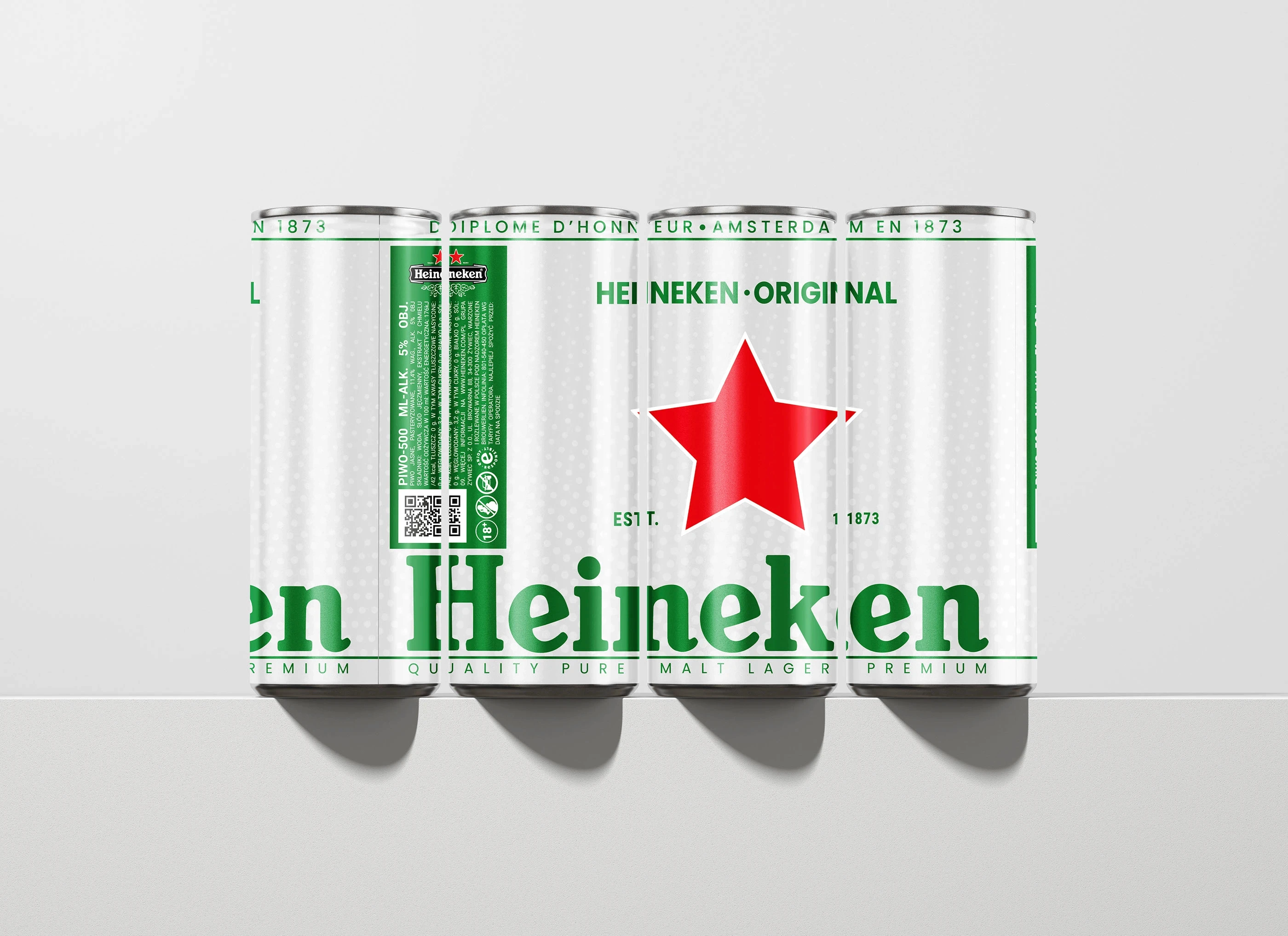
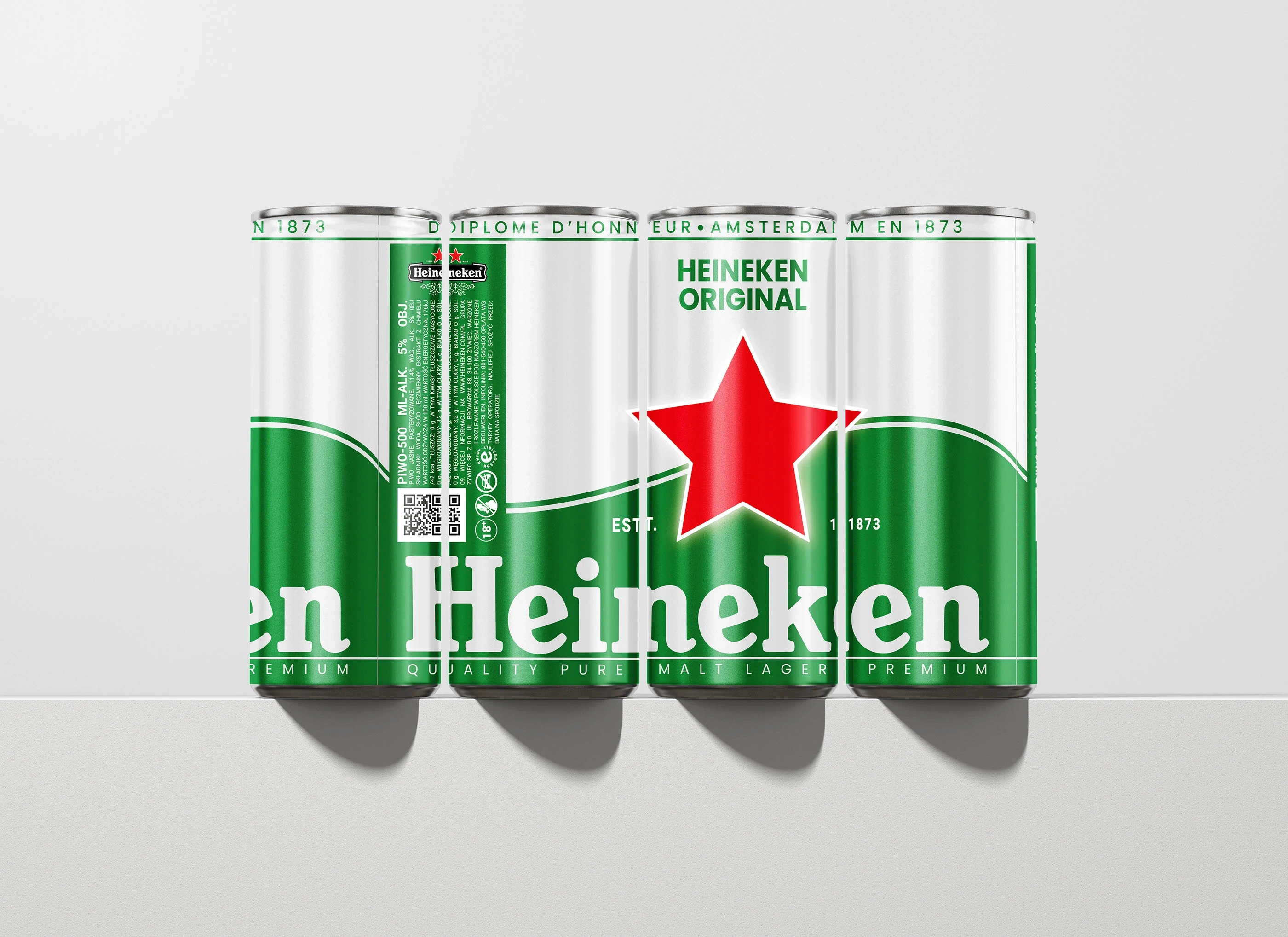
Brand Recognition: Generic appearance on crowded shelves with weak visual hierarchy and poor logo visibility from distance
Sustainability Concerns: Consumer guilt over environmental impact with non-recyclable elements and excessive packaging waste
Target Audience Disconnect: Traditional design language alienating younger consumers who perceive brand as outdated and irrelevant
Functional Limitations: Packaging doesn't protect product quality during transport, leading to damaged goods and negative brand experiences
Premium Perception: Current design fails to justify premium pricing compared to craft beer competitors with superior packaging aesthetics
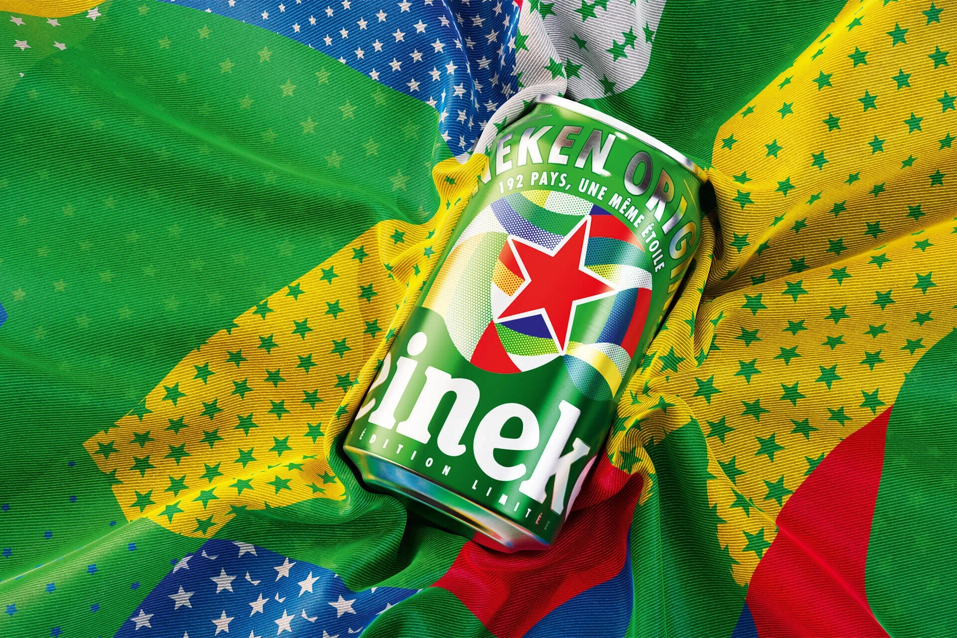
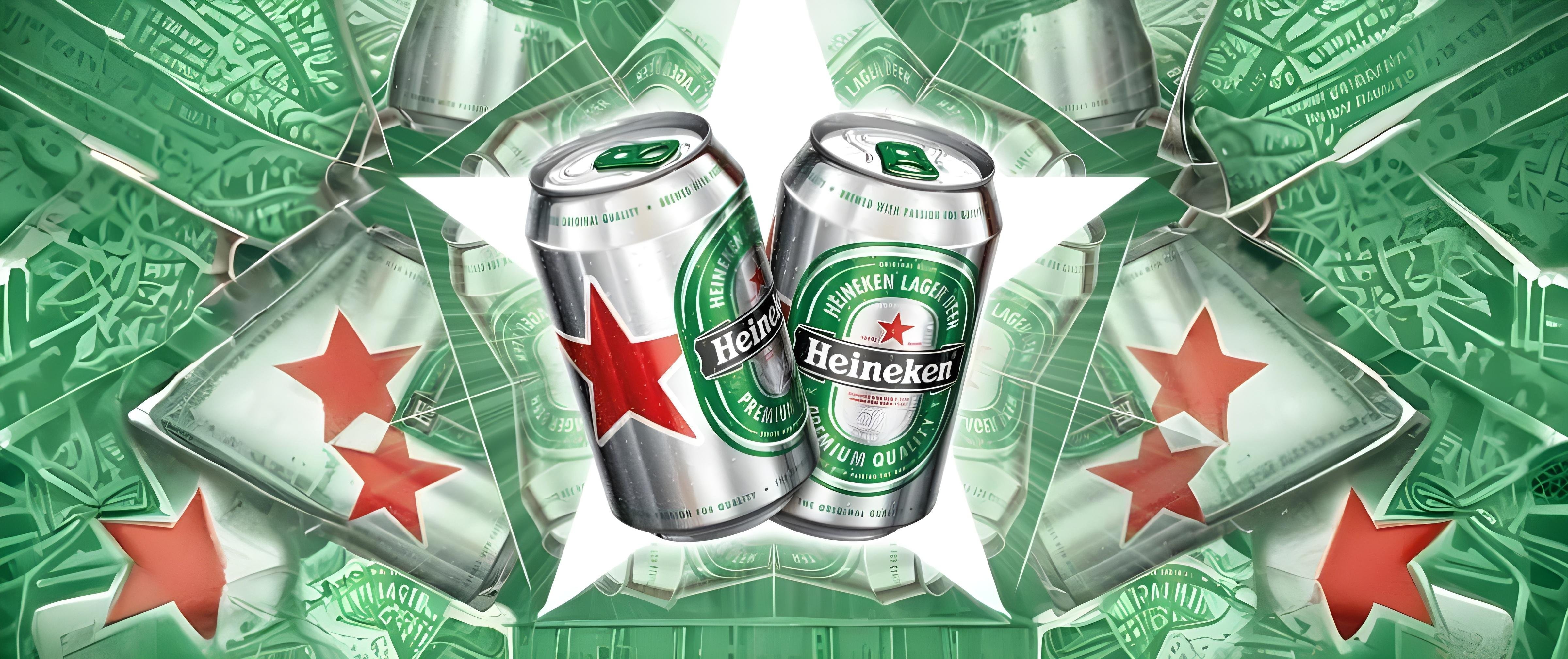
Solution
User-Centric Design: Ergonomic bottle shape with improved grip, reinforced multipack handles, and stackable design for home storage
Bold Visual Identity: High-contrast color palette, enlarged logo placement, and distinctive typography ensuring strong shelf presence
Sustainable Innovation: 100% recyclable materials with clear recycling instructions and reduced packaging volume through efficient design
Contemporary Aesthetics: Modern graphic elements and premium finishes appealing to millennial and Gen-Z consumers while respecting brand heritage
Protective Engineering: Enhanced structural integrity preventing product damage while maintaining cost-effectiveness
Luxury Positioning: Premium material choices, sophisticated color schemes, and tactile elements communicating quality and craftsmanship